
Lede
I asked for something simple. I got talks, not results.
What does not make sense
- “Cutting-edge” that cannot follow a plain instruction.
- Weeks of the same bug while the blog sells upgrades.
- Ten attempts for one usable output. Users pay. Power burns.
- Feedback forms that feel like bins.
- Explanations longer than the job.
Sense check
- A creative tool is judged by outcomes. Not by model names.
- Reliability first. Features later.
- One good result should not require a dozen failures. That is waste by design.
- People are not paid testers. Especially when they already paid.
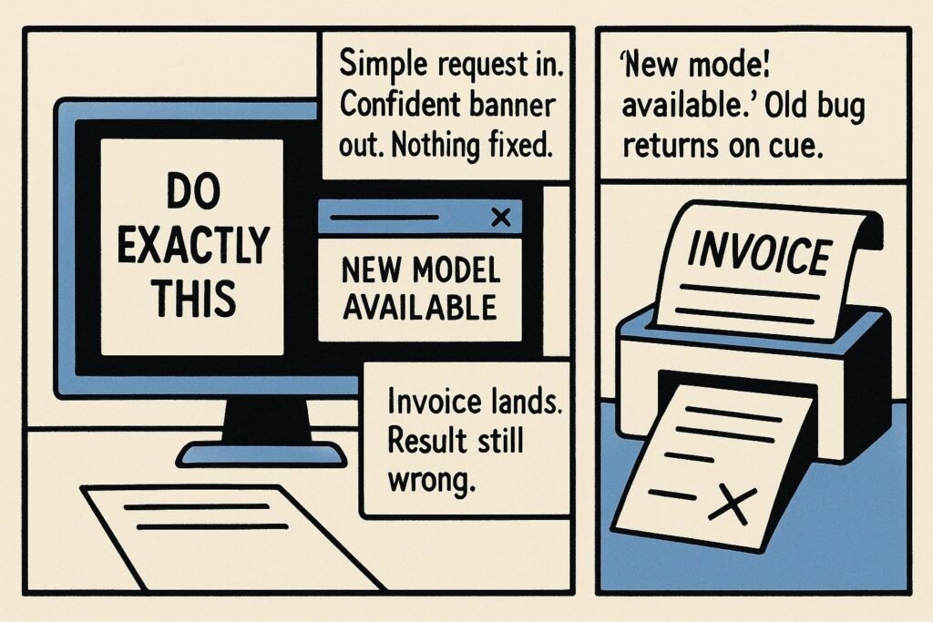
The sketch
- Scene one: Simple request in. Confident banner out. Nothing fixed.
- Scene two: “New model available.” Old bug returns on cue.
- Scene three: Invoice lands. Result still wrong.
What to watch, not the show
- Roadmaps that add styles while the core stays flaky.
- Blame pushed to prompts, phones, or networks.
- No lock tools, no pixel controls, no proper undo history.
- Support loops that thank you for patience instead of shipping a fix.
The Hermit take
Intelligence starts with doing the small things right. If it cannot, it is not smart. It is expensive.
Keep or toss
Toss the hype. Keep the tools that obey.
